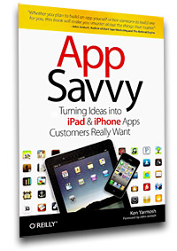
Bridget got this book for me for my Birthday. It was a good read, and it had some useful info, which I’ve shared below.
You have the unique Idea: Sometimes uniqueness and creativity can mean making things that already available but better and more focused than competitors
Market Research: Be realistic on Market:
(Exit Strategy App around NYC Subways)
- Total Market:Apple: 50 million iPhones sold, 35 million iPod touches. This is an 85 million figure.
- Country:
- 50% of devices are in the US. 43 million devices.
- 300 million Americans… which is 43/300, which is 14% (They said 21.5%)
- Narrow: 8 million people in NYC, but 5 million subway riders on any given weekday, so let’s say 6 million ppl
- TARGET MARKET SIZE: Given the 21.5% (err… 14%) device penetration, this means that 1.3 millions contacts among subway riders.
- Realistic: (i.e. Doodle Jump, sold 3.5 million copies, which is 4% of the appmarket.)
- So if Exit Strategy does well, we have 1.3 million x 4% which is 52,000 users. This is the market.
- Country:
- Shows how big/small niche market is. If you’re targeting wheelchair access in Boston. That 750k residents at .5% of the population. This shows a market of 3750. If only 21.5% have apple devices and 4% maximum will buy the app, that’s 32 customers. Not profitable.
App Lifecycle
The more detailed the initial planning (research, wireframes, Feature list, and roadmap), the better for designers and developers.
Get feedback for users to make sure this idea is worth doing
- Discover
- Competitive analysis
- Size of Market
- Personas – to segment or groups customers based on shared qualities and attributes.
- Understand Value Prop
- For [target end user] who wants/needs [compelling reason to buy]. [Product Name] is a [product category] that provides [key benefit]. Unlike [main competitor], [product name][key differentiation].
- If people actually want to user our product and share that experience with others, then we have a winner.
- Understand Customer Experience
- Survey users
- Would they download it
- Why would they use it
- Only show visuals at end to get feedback
- Realistic engagement with app
- Design
- Wireframe Wireframe Wireframe
- Then give to designer to make pretty
- Design: Borrow interface metaphors from physical world. E.g. lightswitches, speedometer, etc.
- Name of app: should find available twitter handles and available URLs
- Parkinson’s Law: Work expands so as to fill the time available for its completion
- Home + Power button takes screenshots.
- People only read headlines. Headlines lead to content (e.g. Flipboard)
- Wireframe Wireframe Wireframe
- Development
- First release must be as simple as possible
- Better to omit a feature than not to get it exactly right.
- Deploy (see below)
Marketing Crescendo
- Phase 1 – Develop marketing strategy. Twitter will be used for industry news and initial conversations. Facebook page will be used for support. Email will be used for blog posts and releases.
- Phase 2 – Use Twitter first to grab and follow the industry/targeted leaders. Grab an open handle, and start creating a buzz. Provide value in your tweets. Use twiangulate.com to find people to follow and whose has common interests.
- Phase 3 – Get your site finished. Start sending out surveys for feedback. Capture emails Email marketing is important to promote updates and splash/landing pages. Generate traffic to your microsite through SEO adds. Start blogging. Facebook page marketing. Repurpose content in the strategies you develop. Sneak peaks
- Phase 4 – App is approved. LAUNCH! All strategies point to this and its promotion. Develop contingency plan if something breaks.
The most important part is to get reviews. This process may even happen before launch.- Google Alerts on App name
- Value of Third Party reviews
- Know who to target for reviews
- When you’re sending out to certain media outlets, try Thursday and Friday since they have less volume
- People want to write about apps that are unique creative, and well done…
- E.g. (ReadWriteWeb | Twitterrati | SocialTimes)
- Social media release (http://www.copyblogger.com/social-media-press-release/)
- Other Ideas: Promotional Pricing for Initial Release, Follow Review Sites, Mobile ad networks, Contests
- Phase 5 – Hardest part. Continue the path towards greatness. Cycle back through for major releases. Slow the path down to the bottom. Create interest with new releases, etc.
Reporting
- Provide meaning reports so developer can make better decisions instead of doing spreadsheet analysis.
- Engagement is most important
- Negative reviews = not a very well described application. Customers feel deceived on their download
Great sites:
- http://148apps.biz/app-store-metrics/?mpage=catcount (Application category distribution)
- http://www.uquery.com/ (App Search Engine)
- http://metrics.admob.com (Good info, but from 2010)
- http://applyzer.com/?mmenu=top1000 (Chart is cool)
- http://mobclix.com/appstore/1 (Application categories)
- http://theymakeapps.com/ (pricing)
- http://code.google.com/mobile/analytics/docs/#mobilesdks (analytics)
- http://www.tipb.com/ | http://mobilecrunch.com (Good stats and blogs)
